
Learning how to read stock charts is one of the most valuable skills you can develop as an investor. You’ll be able to uncover price trends, understand momentum, and time your trades with more precision.
We’ve put together this beginner’s guide on how to read stock market charts and graphs to show you what goes into mastering this approach to analysis, from the different types of stock charts and time frames to actually identifying patterns and interpreting data.
The truth is, though, interpreting charts consistently isn’t easy. Even seasoned investors misread signals, chase false breakouts, or overlook subtle signs of reversal.
There’s a steep learning curve, and it’s easy to drown in indicators, patterns, and conflicting signals that don’t always lead to better decisions. Even if you do master stock chart reading, you’re left glued to your screen all day, monitoring your watch list and trying to make sense of different indicators and configurations.
What if we told you there was a better way to find, analyze, and execute opportunities in the stock market? Introducing VectorVest, the most powerful stock forecasting software in the world.
This system analyzes every stock in the market daily and gives you clear, data-backed ratings for value, safety, and timing alongside a simple buy, sell, or hold signal.
No need to guess, overanalyze, or rely on conflicting opinions. Say goodbye to emotion and human error. Spend less time studying charts and more time making confident moves that yield impressive profits. Get a free stock analysis today and see what’s possible!
What Are Stock Charts?
Stock charts are visual representations of a stock’s price and volume history over a defined period. They clue you into how a stock has behaved over time. That includes where it’s been, how it’s moved, and how buyers and sellers have interacted with it.
This is going to be foundational to your stock analysis if you plan on actively trading or even investing passively in any capacity. Whether you’re swing trading or day trading or living off dividends in retirement, you’ll need to learn how to read stock charts. Types include:
- Line Chart: A simple line connects closing prices over a selected period. It’s easy to read and useful for identifying general trends, but has little depth on daily trading activity.
- Bar Chart: Each bar shows the opening, closing, high, and low prices for a specific day. You get more context than a line chart to spot volatility and reversals.
- Candlestick Chart: Active traders use these charts because they get the same data as bar charts but in a more visual format. The body of the candle shows the range between open and close, and the wicks show the day’s high and low.
- OHLC Chart (Open, High, Low, Close): This is a more detailed version of a bar chart, displaying all four key price points for a given period. It’s popular for technical analysis.
You can filter charts based on different time frames, from minutes to years. The specific chart you choose depends on your strategy. Day traders rely on intraday movements, while long-term investors focus on broader trends over months or years.
Key Components of Stock Charts
There are a few different components you’ll need to familiarize yourself with in order to interpret stock charts:
- Price Axis (Y-Axis): Shows the price range of the stock.
- Time Axis (X-Axis): Displays the selected timeframe (1-day, 1-week, 6-months, etc.).
- Volume Bars: Positioned beneath the price chart to show how many shares were traded in a given period. Volume can confirm price action or warn of weakness.
- Moving Averages: Lines that smooth out price data to help you identify trends. Common ones include the 50-day and 200-day moving averages.
- Indicators and Overlays: You might see tools like RSI (Relative Strength Index), MACD (Moving Average Convergence Divergence), Bollinger Bands, and more. These provide deeper context around momentum, trend strength, and volatility.
- Support and Resistance Lines: Horizontal markers that help you identify price levels where a stock has historically had trouble moving above (resistance) or below (support).
We’ll get more specific about the role each of these plays as we walk you through how to read stock market charts and graphs in a moment. But why learn how to read stock charts in the first place?
Why Learn How to Read Stock Charts?
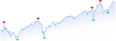
Price action, trading volume, and patterns don’t just tell you what happened in the past – history tends to repeat itself, so stock charts give you an idea of what might happen next with a given stock.
This turns your investing decisions from guesses to calculated moves. Charts help you answer questions like:
- Is this stock in an uptrend or a downtrend?
- Has the price reached a support or resistance level?
- Are buyers gaining strength, or are sellers taking over?
- Is this a temporary dip or the start of a larger move?
In turn, you can time your entries and exits more effectively. Let’s say a stock is approaching a key resistance level. You might wait for a breakout above that line before buying. Or, you may hold off entirely if the RSI indicates the stock is overbought.
Stock chart interpretation also removes emotion from your decision-making, so you stop reacting blindly to headlines. For instance, you might see a stock simply pulling back to a moving average and rather than panic selling, recognize that an uptrend is on the horizon.
Reading stock charts helps you identify patterns, and those patterns signal opportunities. We wrote about common swing trading patterns in our blog: double bottoms, head-and-shoulders, and cup-and-handle all give you an idea of what a stock might do next.
You can also use stock charts to gauge momentum and confirm breakouts. More specifically, volume indicators overlaid on a chart help you avoid false signals. For example, a breakout probably won’t hold if the stock breaks through resistance but with weak volume. This prevents you from falling victim to false signals.
While stock charts are by no means a guarantee of profit, they give you the context and structure you need to make smart, data-driven decisions. So, let’s get into how to read stock charts for beginners below!
How to Read Stock Charts: A Step-by-Step Guide to Interpreting Stock Market Charts
Reading stock charts isn’t just for professional traders or analysts. Although it’s fairly complex, any retail investor can follow the same methodology to see where a stock has been, where it might be going, and whether it’s worth the money. Here’s how to get started.
Step 1: Choose Your Chart Type and Time Frame
Think back to the different types of charts we touched on earlier. Rather than overcomplicating things and risking information overwhelm, we encourage you to narrow it down to just a few charts at first.
Candlestick charts are usually the best starting point. They give you much more information than line charts, showing the open, high, low, and close (OHLC) for each period. You can learn more about the most reliable candlestick patterns in our blog.
Aside from chart type, think carefully about what time frame makes the most sense for your strategy. This is a bit more straightforward. It just comes down to how much of an impact real-time data has on your decision-making.
For instance, a long-term investor might use weekly or monthly charts. A swing trader might look at daily or 4-hour charts. A day trader might zero in on 5-minute or 15-minute charts.
Step 2: Understand Price Bars or Candles
Each candle or bar tells a story about price movement for a specific period:
- Open: Where the stock started trading in that time period.
- Close: Where it ended.
- High and Low: The highest and lowest price during that period.
The candlestick colors matter, too. A green (or white) candle means the close was higher than the open. A red (or black) candle suggests the close was lower than the open.
Let’s say you see a long green candle on a high-volume day. That tells you buyers were in control from start to finish. It could signal a new bullish phase if it breaks above recent highs.
Step 3: Read and Use Volume Data
Volume tells you exactly how many shares were traded during a given time, and clues you into how strong a given trend is. High volume confirms price movement – it’s more trustworthy. Low volumes typically signal indecision or a weak move that might not hold.
You’ll find volume bars under the main price chart so you can confirm any setups you come across. Imagine Microsoft (MSFT) breaks through $350 with an average daily volume of 20 million shares. Today, it traded 50 million – you can reasonably assume that breakout holds weight.
Just make sure you pay attention to volume spikes during earnings, news, or macroeconomic events. These can distort technical signals, so always check the news alongside the chart for context behind the numbers.
Step 4: Learn Key Patterns and What They Mean
We briefly mentioned some of the most common chart patterns you’ll encounter, and we don’t want to get carried away diving too deep into them as we have plenty of other resources on them. Here’s a quick overview of the three most common in the meantime:
- Double Bottom: Looks like a “W.” It shows a stock tested support twice and failed to break lower. Often a bullish reversal pattern.
- Head and Shoulders: Indicates a reversal of a trend. A head with two shoulders shows momentum fading.
- Cup and Handle: A rounded bottom followed by a small pullback. Often precedes a bullish breakout.
Don’t chase patterns blindly. Always validate them with volume and broader trend analysis.
Step 5: Use Support and Resistance Levels
Using support and resistance levels is one of the easiest ways to read stock charts. They show you where, historically, a stock has had trouble moving below (support) or above (resistance). Here’s a reminder of what each tells you:
- Support acts like a floor. If price bounces off it multiple times, it’s a strong level.
- Resistance acts like a ceiling. A breakout above resistance can signal a new trend.
Plotting these levels helps you plan entry and exit points and set stop-loss orders. This is best seen through an example, so let’s assume you’re looking at a chart right now and see that a stock has failed thrice to move past $50. That’s its resistance level.
New resistances (and supports) can emerge as a stock eventually pushes through to new high (or low). Say that imaginary stock does finally break through $50 and volume spikes – you may get a strong move up as short sellers cover and buyers pile in.
Step 6: Add Technical Indicators (But Keep It Simple)
The charts tell you a lot, but you get way more information by layering technical indicators over top of the chart. But there’s a fine line between bolstering your analysis with more data points and overwhelming yourself with too much information.
Don’t clutter your screen with five different tools all telling you the same thing. Instead, rely on just a few of the most useful as you learn how to read stock charts:
- Moving Averages (SMA, EMA): Smooth out price data. The 50-day and 200-day moving averages are common benchmarks.
- Relative Strength Index (RSI): Measures whether a stock is overbought or oversold. An RSI > 70 is possibly overbought, whereas an RSI < 30 is likely oversold.
- MACD (Moving Average Convergence Divergence): Shows momentum shifts. A bullish crossover (MACD line crosses above signal line) can signal a potential buy.
Our blog has a great resource on the best stock indicators if you want to learn more. You can also learn about the best moving averages for swing trading specifically, or the best MACD settings.
Putting It All Together
Charts are complex entities with multiple layers, and you need to be able to zoom in and out to get the big picture and nuanced insights. Don’t just focus on one element. Think of it like a detective building a case:
- What’s the trend: up, down, or sideways?
- Where are key support and resistance levels?
- Is volume confirming recent moves?
- Are there any patterns forming?
- What are your indicators saying, and do they match the price action?
There you have it, how to read stock charts for beginners! We know it’s a lot, but this process eventually becomes second nature with enough practice.
Still, the trial-and-error early on can be costly, and you’ll find it to be very time-consuming and convoluted even once you get the hang of reading stock charts. That’s why we want to quickly touch on a better method…
There’s a Simpler, More Fool-Proof Way to Analyze Stocks…
VectorVest is the #1 stock picker and stock analysis software for beginner and expert investors alike, across all trading strategies. Using our stock advisory is the smarter alternative to constantly staring at stock screens, hoping to make sense of the raw data.
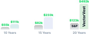
It has outperformed the S&P 500 index by 10x over the past 20 years and counting, calling every major market move along the way to help investors capitalize during times of prosperity and move to portfolio protection when things get dicey.
The best part? It saves you time and stress while helping you win more trades with less work. Rather than spending hours reading and interpreting stock charts, you’re given a clear buy, sell, or hold recommendation for any of the 18,000 stocks we track – at any given time.
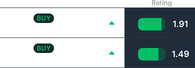
The proprietary system we’ve developed relies on just 3 simple indicators: relative value (RV), relative safety (RS), and relative timing (RT). Each sits on an intuitive scale of 0.00-2.00 with 1.00 being the average, supporting effortless analysis and execution.
You’ll also get real-time alerts from Nasdaq last sale data (NLS), market sentiment indicators, and pre-built stock screeners tailored to your risk profile and goals.
It’s the best stock app for iPhone and the best Android stock app, and you’ll understand why once you get the opportunity to bring these features into your investment arsenal. Get started today and discover the difference firsthand!
Wrapping Up Our Beginner’s Guide on How to Read Stock Market Charts and Graphs
That does it for our beginner’s guide on how to read stock market charts and graphs! We hope you feel confident in all the moving pieces and understand different types of charts, various indicators, and strategies for confirming patterns before executing your strategy.
But while you came here to learn how to read stock charts, you’re ultimately working harder and with less precision if you rely on these. Whether you’re trying to grow your IRA or trade more actively, VectorVest helps you focus on the right stocks at the right time – without guessing.
We’re the #1 Motley Fool alternative and the best TradingView alternative. Find out why. Set yourself up for smooth, stress-free investing success with VectorVest today!
What you should do next…
- Get our latest blogs delivered right to your inbox, subscribe to our newsletter.
- The market moves fast! Get our most current evaluation of this stock with our FREE stock analysis tool.
- Looking for stock picks? Not sure if now is the right time to buy/sell? For a limited time, enjoy the full benefits of a 30-day subscription to VectorVest for only [offer_txt] (usually up to [saving_txt]/month) . Get access to our full list of screeners showcasing our top stock picks that tell you exactly what to buy, when to buy, and when to sell.


